

The Lighthouse Circle

The Client
The Lighthouse Circle is a non-profit that aims to provides a conduit of community, resources, research and support to individuals who have been given a life-altering health diagnosis through an online portal. They envisioned a site that will enable individuals to unlock their potential to achieve ultimate health and awareness.
The Lighthouse Circle is still in development, and called upon our team to conduct a usability evaluation in order to understand what key issues might exist and opportunities to improve the experience for a user base that may already be struggling with difficult circumstances.
The Goals
• Conduct usability testing to determine site’s current usability
• Report usability issues and areas for improvement to client
• Recommend usability improvements for future site iterations
The Solution
Usability review and testing revealed several key usability issues in the beta version of the site: low visibility of key information about the site’s offerings, hierarchy and consistency issues, and feeling a lack of connection in a site meant to create community.
I prepared a findings and recommendations report for the client with low-fidelity wireframes illustrating potential changes to address these key issues. Some of the changes included increasing visibility of the public landing page by placing key information above the fold, simplifying navigation in the private portal, and adding a social feed to eliminate feelings of isolation.
Tools and Methods
Usability Review VoiceOver Affinity Diagramming Think-Aloud Usability Testing (Remote and In-person) Keynote Sketch Axure

Usability review criteria and notes

Usability review criteria and notes
Usability Review
The Lighthouse Circle was invested in assuring a high level of usability, so I began by conducting a usability review using criteria aligning with the organization’s goals and site goals of communicating their value, encouraging joining the portal, and facilitating connections between users with shared experiences.
I also carried out the review with the perspective of the primary site users in mind—people who have been diagnosed with a life-altering illness and may still be processing the new, or dealing with tough symptoms; people looking for information, resources, and support during a difficult journey.
“My courage is stronger than my fear.”
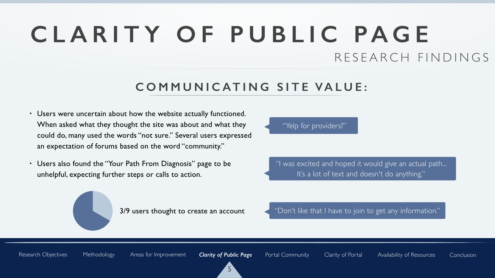
With my criteria and users in mind, some of the issues I noted included a lack of clarity about what the site offered, an absence of social features, and some potentially confusing navigation elements.
VoiceOver
While not the main goal of testing, I also chose to try to use the site with VoiceOver, Apple’s screen reader software, to further understand how someone dealing with vision or other issues from their illness might experience the site. It was an eye-opening look into accessibility and understanding how people using screen readers navigate digital spaces! Though I’m inexperienced with screen reading software, I was discovered a few choke points in the screen reader experience such as unlabeled or non-functional buttons.
Planning Phase
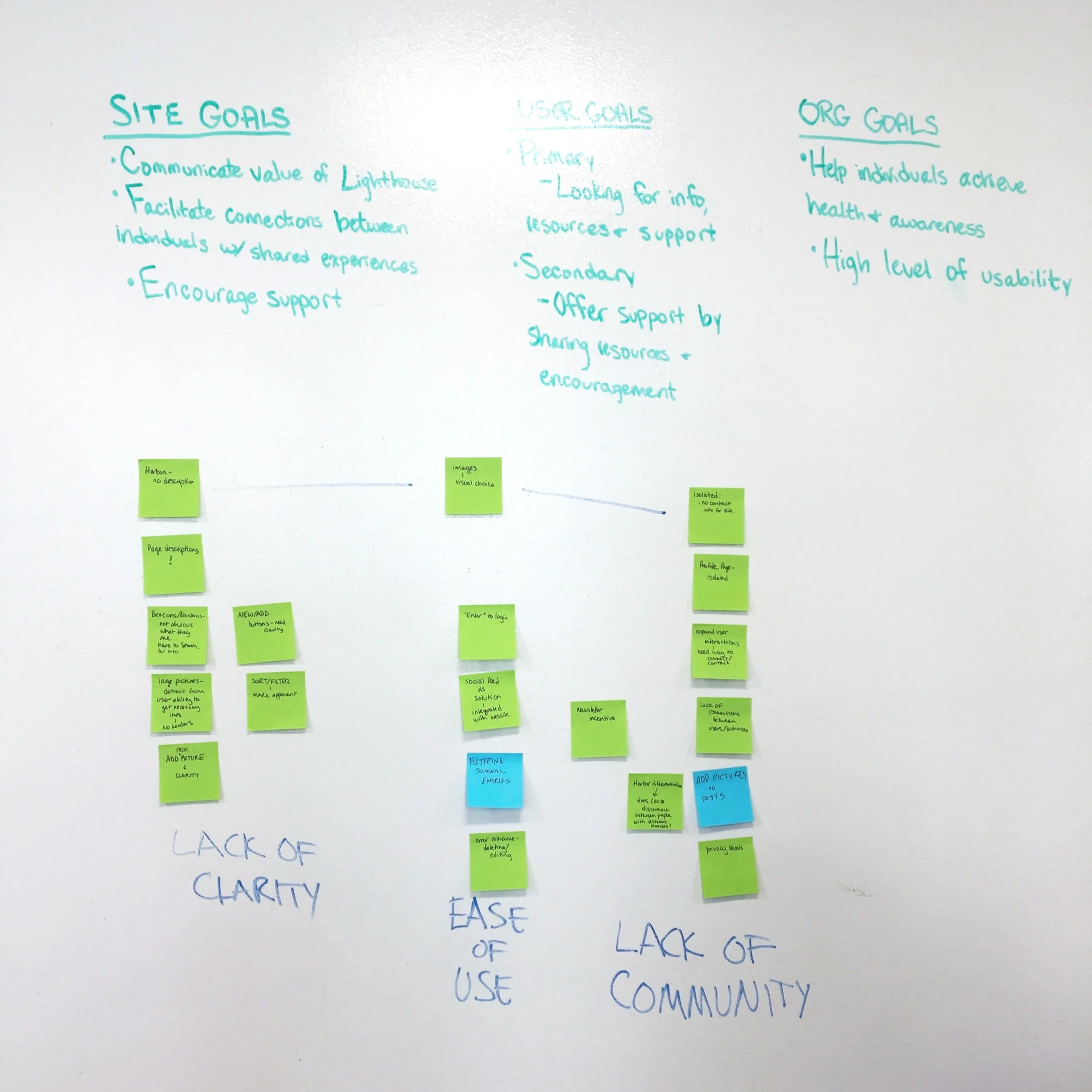
Having completed independent reviews, our team came together to compare our findings. After pulling out the most common or striking issues, we used affinity diagramming to establish three broad categories of usability problem areas: lack of clarity, ease of use, and lack of community.
Together we then wrote an evaluation test script designed to discover if users would experience difficulty in these areas, and to test the usability of specific functions that the primary site user would commonly utilize.
Usability Testing

Our team conducted nine rounds of usability testing, six remote and three in-person. The testing revealed many new and valuable insights, such as a desire for the ability to donate to individuals, and a lack of visible resources on both the public site and portal.
Testers did resonate with the site’s overall purpose, able to see the positive impact it would have on the lives of future users.
“A great tool for ‘in-between’ moments.”
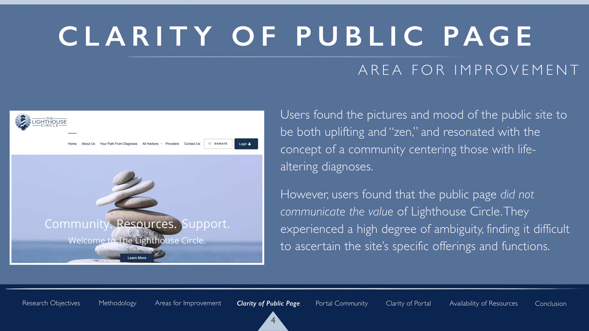
However, they also found it difficult to determine the site’s value from the public side, felt disconnected within the portal, and were confused by some of the portal’s functions.
“I feel actively disconnected.”
Recommending Improvements
After the usability evaluations, our team came together again to synthesize our findings and draw insights from this new research. After highlighting consistent themes and problems, I found that many fell into four categories: the clarity of the public site, the lack of community in the portal, a lack of clarity in the portal, and the availability of resources.
I prepared a report for the client focusing on these four areas for improvement, with research findings and recommendations to address the issues.
Prototyping Changes

Home Page mockup
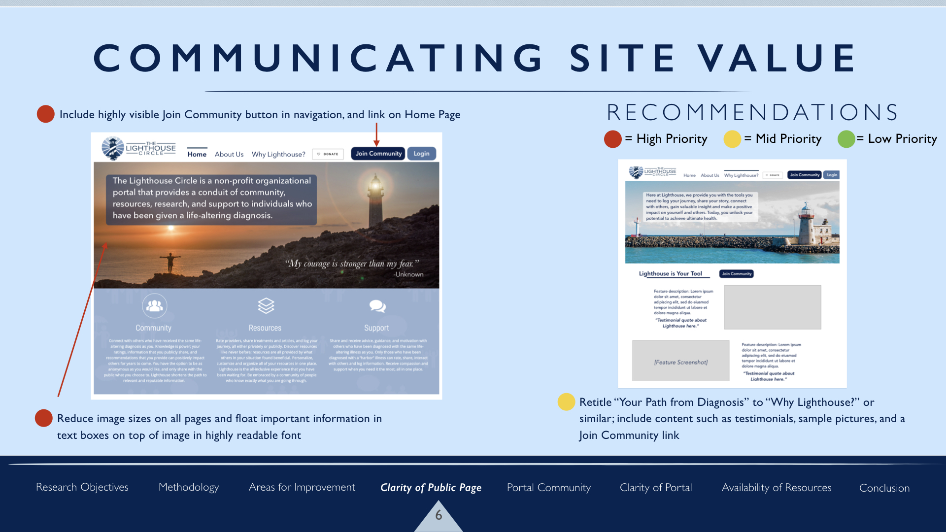
While users understood the intent of the site while first taking a look, they were confused about how the site actually functioned and its offerings. I created prototypes with changes to the page hierarchy to include useful information above the fold, and increasing visibility of site function descriptions.

Harbor Page mockup
Beacon, Harbor, and Lantern are key terms in understanding the site’s functions, but users were often unable to quickly determine what these terms meant and how they functioned. I created low-fidelity wireframes for the home page and Harbor pages with visibility in mind, to ensure that users clearly understood the terms and what they meant in context of the site’s offerings.

Social feed mockup
One of the greatest issues users encountered was the lack of community and connection through the portal. When first encountering the site, many assumed it would have forums or social feed based on the word “community.” However, the only current social feature is the ability to add contacts, and one has to specifically search out an individual to see content from other users. I advised the client consider adding a social feed feature to make it easier to users to interact, as well as discover helpful and relevant information.
Interactive Prototype
After submitting the client report, I also created a prototype in Axure RP that shows how the public site might look and function with the recommended updates for clarity, while remaining consistent with the site’s current branding and visual identity.