client
Creatively Focused is dedicated to strengthening special education programs and reducing burnout in special educators. Their professional development services have proven tremendously successful, and needed. In a profession where paperwork accounts for 35% of their workload but only 10% of allotted time, special educators often spend hours on the internet searching for what they need to complete their paperwork.
Creatively Focused has created and curated a wealth of helpful resources, but these resources were only accessible to their clients via email with their coaches. As they grow, Creatively Focused has sought a way to host these resources, making them easily accessible to clients and non-clients alike, which would reduce the communication overload they currently face, and drive engagement from new potential members.
goals
• Understand current experiences and stressors that special educators and coaches face
• Understand current problem space and competitors, if any
• Learn what would support experience of finding and using resources
• Conduct evaluations and testing to determine prototype’s value and usability
• Create high-fidelity interactive prototype of proposed solution
solution
To make these resources more accessible, support teachers and coaches and drive engagement, our team designed the Creatively Focused Portal. We emphasized making resources easily findable and supported with in-site guidance. Coaching clients can easily schedule meetings and collaborate with their coach in a virtual shared workspace. The Portal serves as one-stop shop where special educators can find resources and guidance when they need it most.
As the visual lead and main prototyper, I focused on making the site easily navigable with a high level of clarity. I kept the design simple and clean, to present information in a straightforward manner and mitigate stress a user might be feeling.
tools and methods
Secondary Research Interviews Personas Journey Maps Low Fidelity Prototypes Usability Testing
High Fidelity Interactive Prototype Sketch Photoshop Keynote Figma
client kickoff
We kicked off the project by meeting our clients from Creatively Focused to learn more about the problem space. During the meeting, their passion for improving the lives of special educators was inspiring. We learned that Creatively Focused has created and curated a wealth of resources such as templates. These resources, however, were relatively inaccessible to teachers on their own. Creatively Focused envisioned a repository for these resources and a chatbot to help guide teachers to the ones they need.
user research with special educators
From the outset, our team faced the challenge of trying to organize complex resources in an unfamiliar space. To guide our research, we turned to the real experts. We conducted interviews with Creatively Focused coaches and current special educators, and gained many useful insights. We learned that:
• Special educators often are not even sure what they’re looking for, and find it difficult to narrow down their needs
• Creatively Focused coaches currently experience a lot of redundant communication about finding the right paperwork resources
• All participants agreed that adding additional supportive features, like tutorials, would be a huge asset
group think wireframes and round 1 prototyping
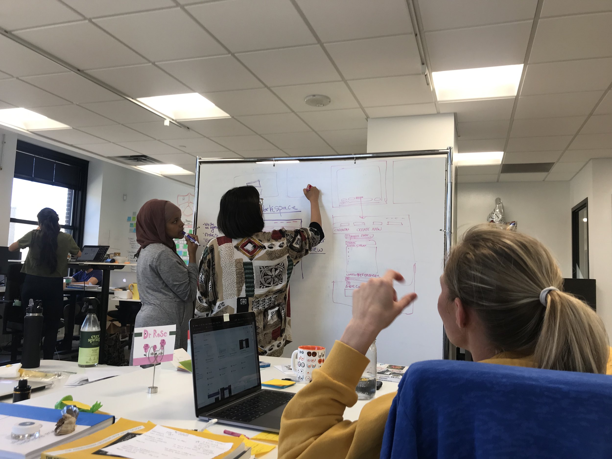
With these insights in mind, our team began ideating around a solution. Together we ideated how this potential space might function, and then each created a set of initial wireframes representing how we envisioned the experience. We then came together to select and combine features to move forward. Knowing that the next phase was usability testing and ideation, we chose to move forward into mid-fidelity.
Using Figma, I created an initial interactive prototype as version one of the Portal. Version one included a resources section with video and written guidance on individual resource pages, a learning section with videos and articles, and a blog/vlog where Creatively Focused could express their unique voice.
My teammate, Rose Keimig, also created a test version of the chatbot using Flow XO, designed to help guide users from broad concerns to specific resources.
usability testing with special educators
We conducted several rounds of evaluations and usability testing with coaches and special educators, refining and expanding the prototype along the way. Users responded with a great deal of enthusiasm, saying they hadn’t seen anything like it before, and very much appreciated the idea of having everything they might need in one place.
These evaluations also produced valuable insights to help progress the prototype, such as the desire to be able to connect and collaborate with coaches online. One challenge our team had been tackling was what elements should be kept behind a paywall, and our participants offered many reactions and insights that helped us determine which elements those would be.
In our testing, users responded well to the chatbot, finding its tone to be friendly and the progression to be useful in helping them narrow down what resource they needed for the test situation.
final prototyping and handoff
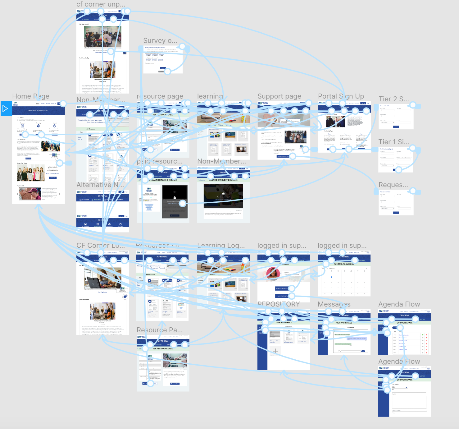
Having gained these insights from the testing sessions, I set forth moving the prototype into interactive, high-fidelity. I revamped the existing support session to include easy scheduling with coaches, and a shared workspace where clients can view their meeting history, share files, and quickly ask questions about their concerns. I also reestablished the hierarchy of some pages, and added additional interactive elements such as member sign-up and a quick survey to help Creatively Focused collect more data about their users.
Interactivity in Figma
To view the live interactive prototype, click below:
For client handoff, we created a packet including prototype links, assets and a simple style guide to help communicate the design to any future developers and designers who might pick up the project where our role ended.


